We are inherently aware of risk/reward tradeoffs in many everyday situations. Easy example: To save time, most of us opt for the highway over side streets despite the risk of a more serious accident on the highway. We’re also inherently aware of limits to the risk/reward relationship. It’s one thing to take the highway; it’s quite another to put the pedal to the metal and weave in and out of traffic (especially in my station wagon, but that’s beside the point). After accounting for the risk of speeding tickets and, God forbid, a high-speed accident, overly aggressive driving probably doesn’t save us much time in the long run, which means it’s an additional risk for no discernible reward, and taking uncompensated risk doesn’t make much sense in this or any situation, including your investment portfolio.
Finding the sweet spot of risk versus reward in an investment portfolio may be less intuitive than my reckless driving example, but we can look to history and see what we can learn. In this article, I’m going to demonstrate that including a small slice of bonds in an otherwise 100% global stock portfolio has reduced volatility with no meaningful impact on long-term returns. Further, I’m going to present a couple historical scenarios to demonstrate how much of a lifeboat bonds have been during intense market downturns, which I argue helps investors stick to their plans during tough times.
Section I: Avoiding Uncompensated Risk
Most people are familiar with the risk/reward tradeoff of stocks and bonds. If you need or want less volatility in your portfolio, bonds get an increasing weight, and you implicitly pay for the lower volatility in the form of lower returns. On the flipside, if you’re willing and able to take risk (two components of having a high risk-tolerance), then you should favor stocks and go for the higher returns. To that end, for those with the highest risk tolerance, is 100% stocks the right allocation? In the same way that overly aggressive driving likely doesn’t pay off even for those who can stomach the risks, a 100% stock portfolio might be taking some uncompensated risk.
More Stocks → More Risk
Let’s arbitrarily build two portfolios: 1) 100% stocks consisting of the global stock market, and 2) a portfolio of 80% stocks and 20% long-term US Government Bonds, i.e., adding some bonds to the global stock market portfolio. We’ll call this the 80/20 portfolio.1,2,3 Note to my fellow nerds: In the appendix, I address why I’ve chosen long-term bonds versus other bonds.
The chart below shows the rolling 12-month trailing returns for the global stock market and our 80/20 portfolio. When the series were above zero, the respective portfolios had a positive return over the previous 12 months, and vice versa when the lines were below zero. For reference, I’ve shaded the areas where the global stock market had a negative 12-month trailing return, which will be helpful for the next few charts in this section.
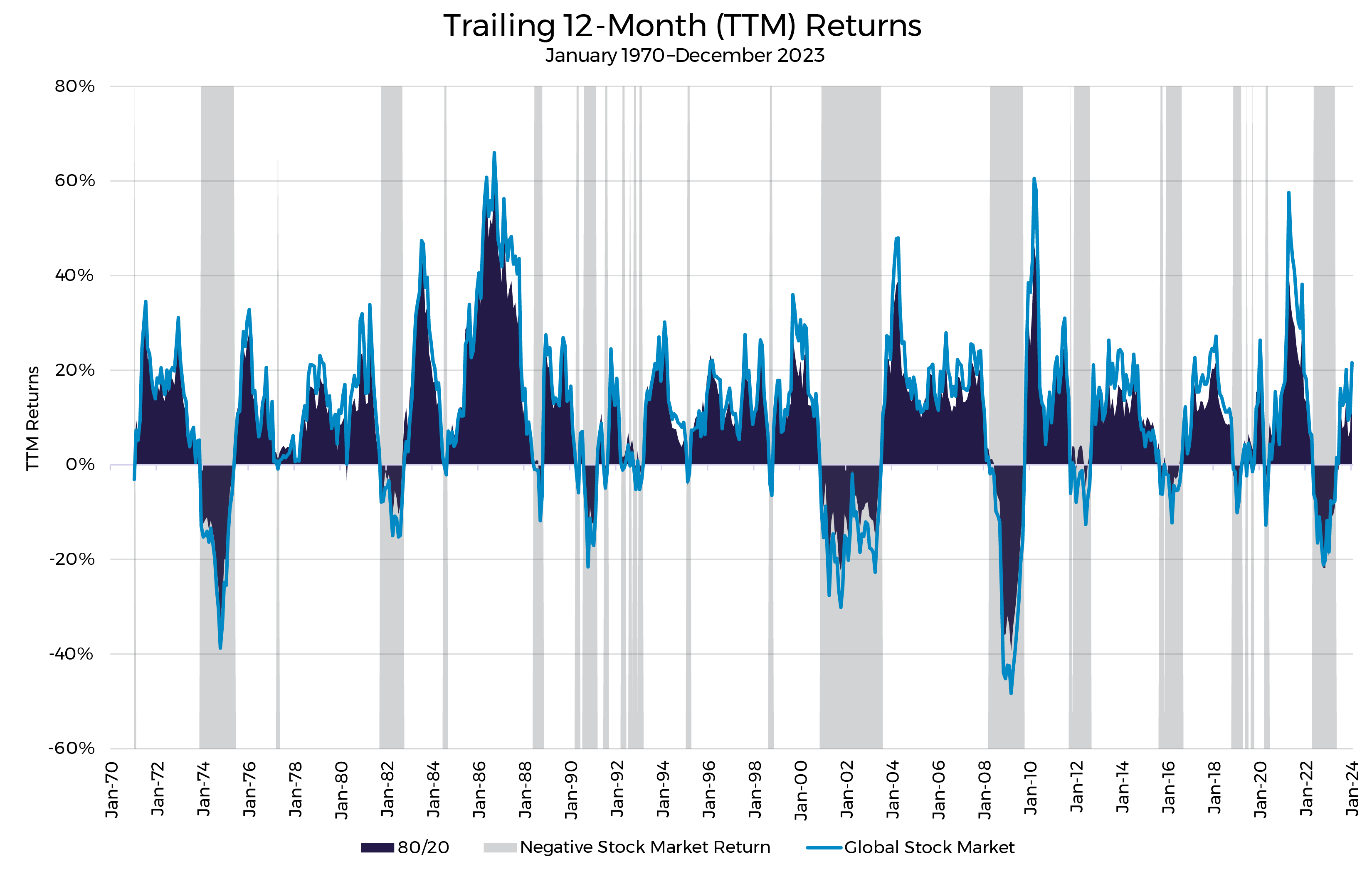
If you look closely, there’s often a gap, which means that when the market was up, the 80/20 portfolio lagged slightly, and when the market was down, the 80/20 portfolio reduced the damage.
Let’s examine that gap and isolate the impact of including bonds in the stock portfolio. In the chart below, when the blue area is above zero, the 80/20 portfolio outperformed the 100% stock portfolio over the previous 12 months, and vice versa. In other words, when it is positive, bonds helped, and when negative, bonds hurt. The gray area still indicates when the trailing 12-month stock market return was negative.
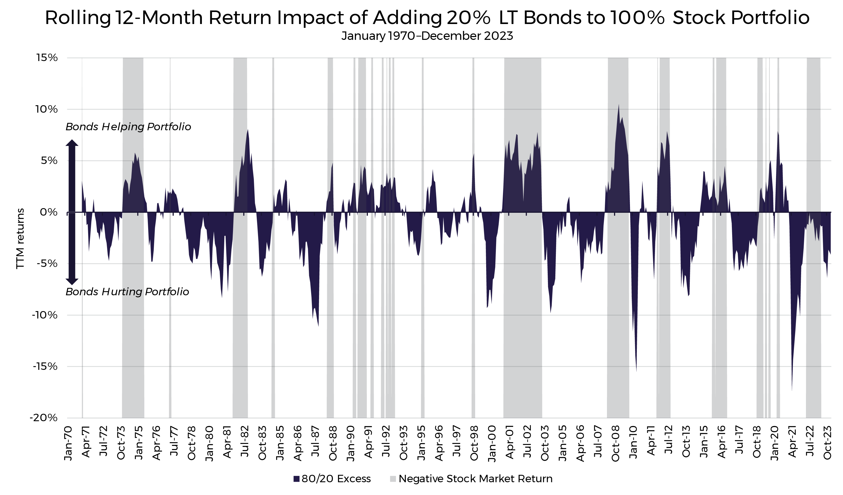
Note what was happening when the stock market was down (gray shaded areas). Bonds tended to help the portfolio when the stock market was down, sometimes significantly and for long periods of time. To make it abundantly clear, the chart below is the same except for leaving only periods when the global stock market had a negative 12-month return.
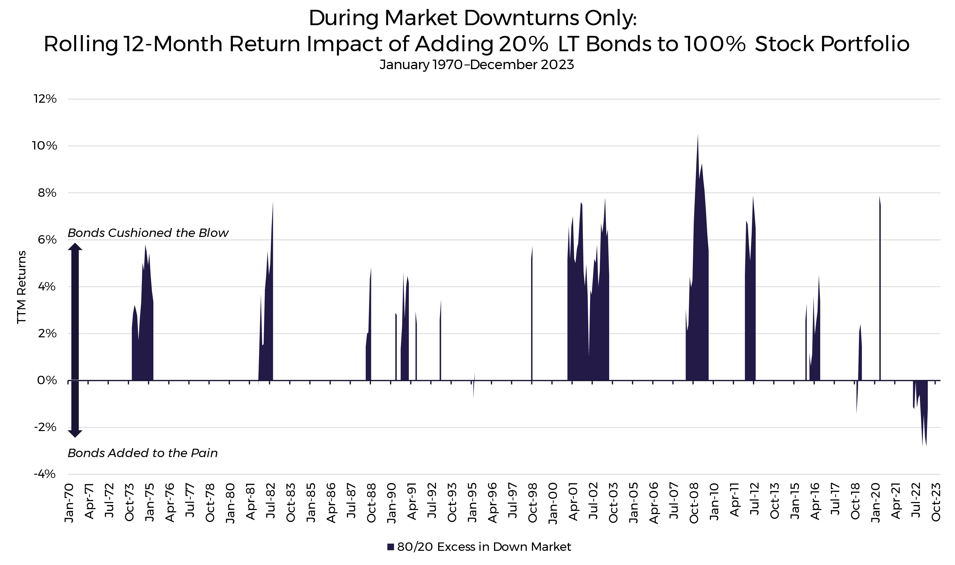
I’m hoping this makes it painfully obvious. During stock market downturns, bonds have historically been a huge source of stability in stock portfolios, on average, thus reducing risk in the portfolio during times when you most need risk-reduction.
I’d be remiss not to acknowledge the glaring exception of 2022, and I address that in the appendix. I also include additional statistics for my fellow nerds who are asking about the realized standard deviation of the two portfolios (spoiler alert: the 80/20 portfolio had lower realized volatility).
More Stocks → More Return?
If you’re already familiar with the risk and return characteristics of stocks and bonds, this has all been old news so far. Of course, bonds are less volatile and don’t drop as much as stocks in downturns, but they are also a drag when markets are going up. Thanks for nothing, Steve. Point taken, but it’s not quite that simple. Let’s take a closer look at the impact on returns and whether bonds truly are a drag on the portfolio over the long run.
The chart below shows the cumulative returns over 54 years of the global stock market, long-term bonds, and our 80/20 portfolio.
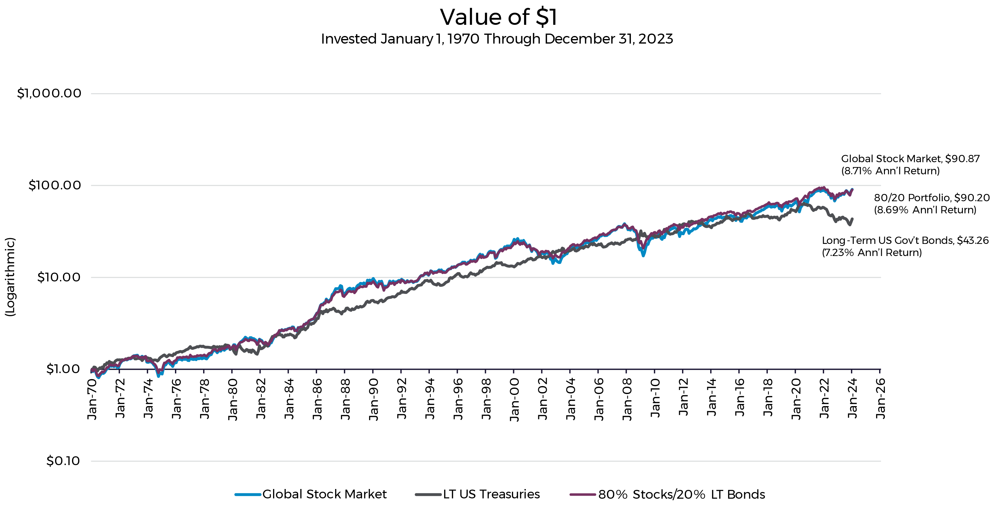
First, the easy comparison of stocks vs bonds: Over this 54-year sample, you’d have had 2.1x as much money investing 100% in the stock market than if you’d chosen long-term bonds. Sure, the bond line is much smoother, but as long as you hung in there, stocks easily won out in the long run. In other words, it appears that the white knuckling of the 100% stock portfolio paid off relative to bonds. Maybe it did when comparing the two ends of the spectrum, but what if we reduce risk just a little bit, as in the 80/20 portfolio?
At this scale, the differences between the 80/20 portfolio and the 100% global stock portfolio are almost indiscernible without the labels. The 80/20 portfolio realized a slightly lower return of ~0.02% per year — essentially no difference.
To ensure this long-term result isn’t driven by one or two extreme time periods, we can look at shorter time horizons within the sample. The charts below depict differences of rolling 10-, 20- and 30-year returns within the 54-year sample. When the blue is above zero, the 80/20 portfolio had higher returns than the 100% stock portfolio and vice versa.

What Do I Notice?
- Measuring by 10-year-trailing returns, the two portfolios traded the leading position many times. If the long-term relative performance was driven by 1–2 outliers, we would expect to see a couple big spikes in either direction and the rest of the chart on the other side of the line.
- While the 12-month return differences can be significant (up to 10%–15% in extreme years, per the earlier charts), as we look at longer and longer time horizons, the differences are much smaller. On a 20-year basis, the annualized differences rarely broke outside of +/- 1%. On a 30-year horizon, the annualized differences were rarely outside of +/- 0.5%.
Summarizing Risk and Reward
- Risk: While adding bonds to a stock portfolio means the portfolio might lag when the market is doing well, it has also provided material protection during almost every market downturn in our sample. On average, it’s fair to say that the inclusion of bonds has historically reduced volatility (see appendix for the statistics).
- Reward (returns): Over the long run, allocating 20% of an otherwise 100% stock portfolio to long-term bonds has had an all but immeasurable impact on returns.
In other words, by including a small amount of bonds in your stock portfolio, you’re likely getting a material reduction in risk for no discernible difference in long-run returns, and this is why Harry Markowitz reportedly said, “Diversification is the only free lunch in investing.”4
Section II: Sticking to Your Plan
Thus far, I’ve shown you that, historically, you could have significantly reduced volatility in your stock portfolio without sacrificing any returns. If you can take less risk for the same outcome, you might as well do so. But we’re still talking about the same outcome, meaning you don’t have MORE money, you just had a less wild ride to get there. I would argue there’s considerable value in the smoother ride, as the smoother ride helps us stay in our seats and stick to our plan.
Despite its overuse, the quote often attributed to Mike Tyson is too perfect: “Everyone has a plan until they get punched in the face.” Going back to my highway driving example, what if I opt for the pedal-to-the-metal strategy only to find I’m not as comfortable with risk as I thought. Say I’m humming along at 30 mph over the limit and come over a ridge to find a cop waiting to give me a massive ticket for reckless driving, not to mention vaporize my time savings and some of my wallet. After accepting my ticket and getting back on the road (and emotionally processing my future of higher insurance premiums), if I don’t have the stomach to keep up the excessive speed, then I have no chance to recover the lost time, and I end up worse off than if I’d simply maintained reasonable speed from the start.
Getting a reckless driving ticket is not unlike a sudden market downturn in a 100% stock portfolio. The stock market has delivered fantastic returns over the long run, as depicted in the cumulative return charts above, and the plan is so simple! All you need to do is hang on through those blips in the chart along the way, and long-term returns of ~9% seem all but guaranteed. But a “blip” on a long-term chart is more akin to a punch in the face while it’s happening, and for better or worse, some of the best returns occur on the backs of some of the worst returns. If you lose your nerve and bail out when things are down, you risk not capturing the long-term returns that seem so easy and all but guaranteed. Let’s take a closer look at a couple of the more extreme historical “blips.”
Market Extreme Example 1: Deflation of the Tech Bubble

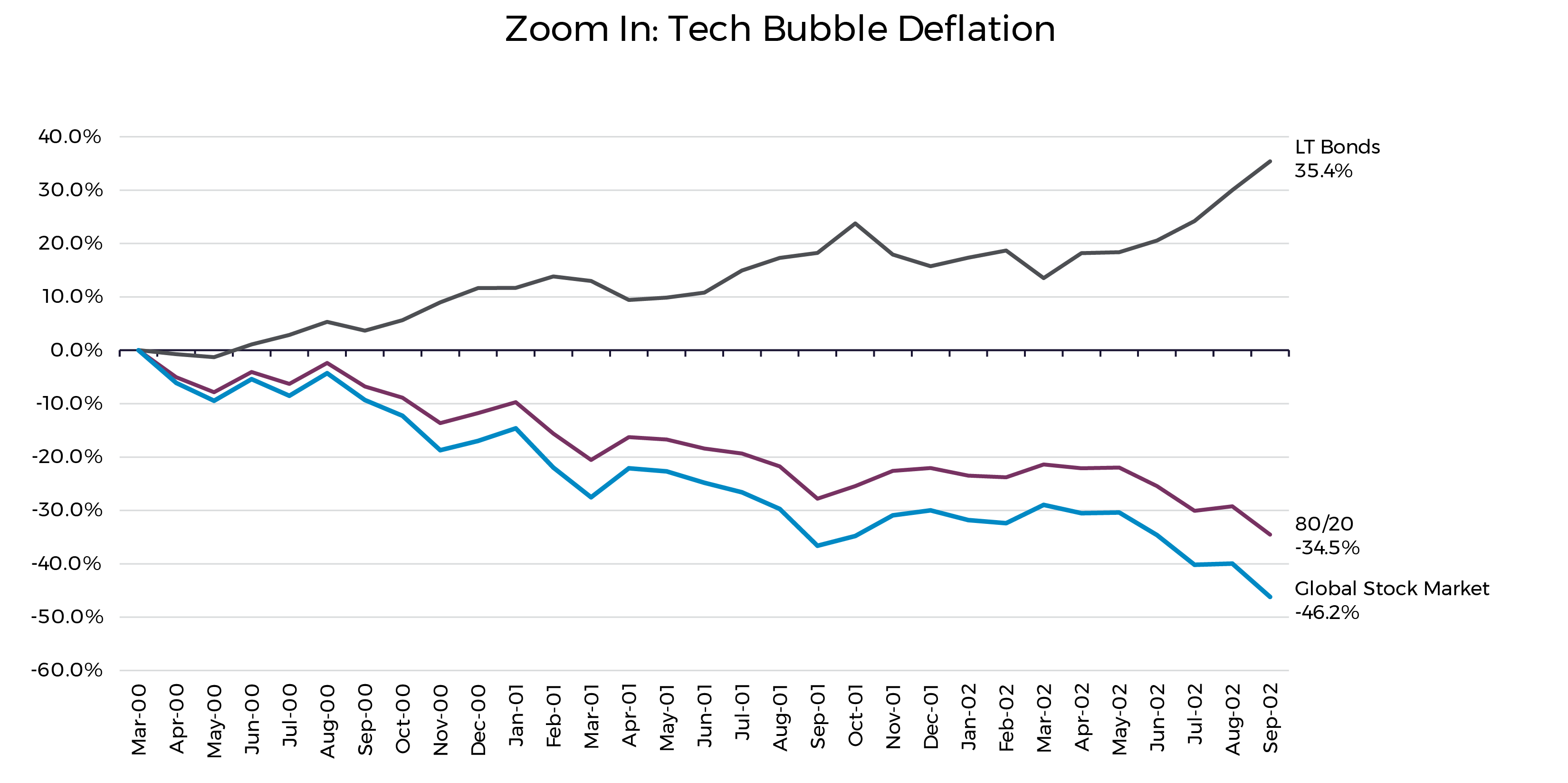
While it looks like a hiccup in the 54-year chart, the global stock market dropped 46.2% from April 2000 through September 2002 with the deflation of the tech bubble. It was a long, drawn-out slog of repricing those rosy valuations and reckoning with the fact that companies still need to make a profit. You couldn’t blame someone for feeling more than a bit jittery and wanting to pull the proverbial portfolio ripcord during those times. But while the stock market was melting, what happened to our trusty bonds? Over that same period, long-term government bonds returned 35.4%!
Yes, on all objective metrics, your total 80/20 portfolio still got creamed, but at least you had something in your portfolio that increased in value and provided reassurance that all was, in fact, not lost. Further, if you were able to stay in your seat, the stock market returned 27.3% over the subsequent 12 months, a spectacular return that you wouldn’t want to miss, and it then continued its long-term march upward.
Market Extreme Example 2: Global Financial Crisis

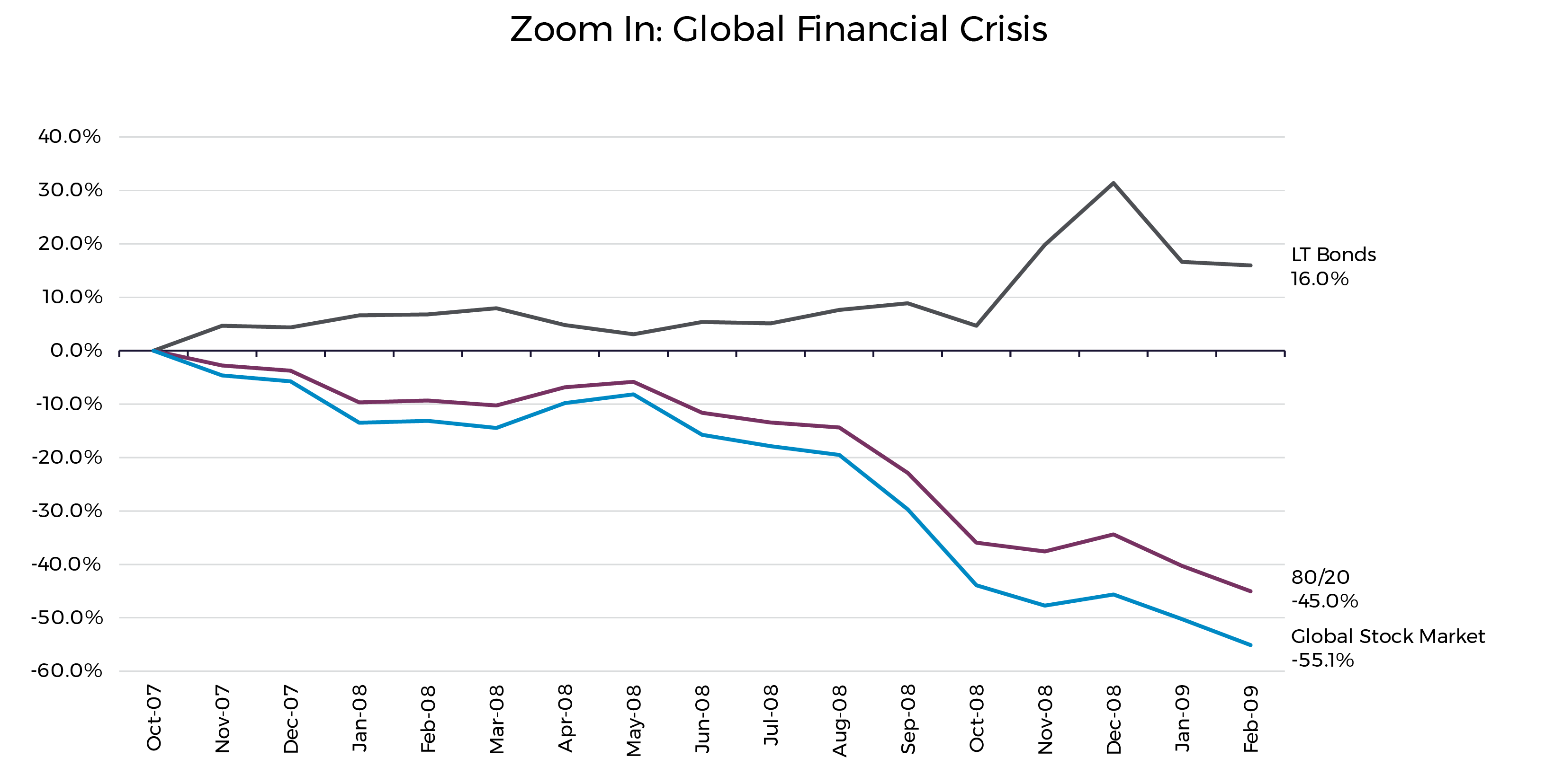
From November 2007 to February 2009, the global stock market dropped 55.1% — an even faster and deeper drop than the Tech Bubble. Even if I were sitting next to you showing you all the beautiful, long-term, upward-sloping historical charts and reassuring you that markets have always recovered (like they did after the Tech Bubble), a 55% drop would be difficult to endure for most people, even those who claim they can handle volatility. Lo and behold, during that same period, long-term government bonds returned a positive 16.0%!
Further, in the three months after this drop, the stock market staged a 33.9% rebound, the highest 3-month return in this 54-year sample. No, it wasn’t a full recovery (that took until 2013), but the recovery would take a lot longer if you’d bailed out and not participated in the breakneck recovery from the bottom.
I am cherry picking extreme examples, and that’s exactly my intention because that’s when bonds really shine. These and other downturns were extremely painful and stressful while they were happening, and the path to recovery wasn’t clear at the time. It never is while we’re in it. CNBC and the Wall Street Journal were (probably) talking about market freefalls with no end in sight. People were losing jobs and losing their homes. And every Tom, Dick and Harry who hides their money in the mattress instead of investing in the stock market were smugly telling everyone “I told you so.” It is not easy to ride these out, but you’d have missed sharp recoveries if you’d bailed when things were most bleak. Including bonds in your portfolio protected wealth and provided reassurance during these times, likely increasing the chances of staying in your chair and achieving your long-term wealth goals.
Conclusion
It’s pretty simple. Based on historical data going back to 1970, including a small portion of long-term bonds in an otherwise 100% stock portfolio has done the following:
- Reduced portfolio risk
- Cost very little, if anything, in the form of returns
- Helped you stick to your plan when a “blip” in the long-term path sends your stock portfolio down 30%–50%
As always, there are no guarantees about the future, but for my money and risk budget, I’ll be keeping my station wagon to a reasonable speed on the highway and holding onto my slice of bonds in my portfolio.
Appendix: For Those Who Haven’t Had Enough
The Statistics
I deliberately avoided most statistic-talk up to this point because I didn’t want readers’ eyes to glaze over with discussion of correlations and standard deviations and blah, blah, blah. But now, for the mathletes like me who crave the statistical approach, here are some brief statistics on the two components of our portfolio as well as the 80/20 combined portfolio:
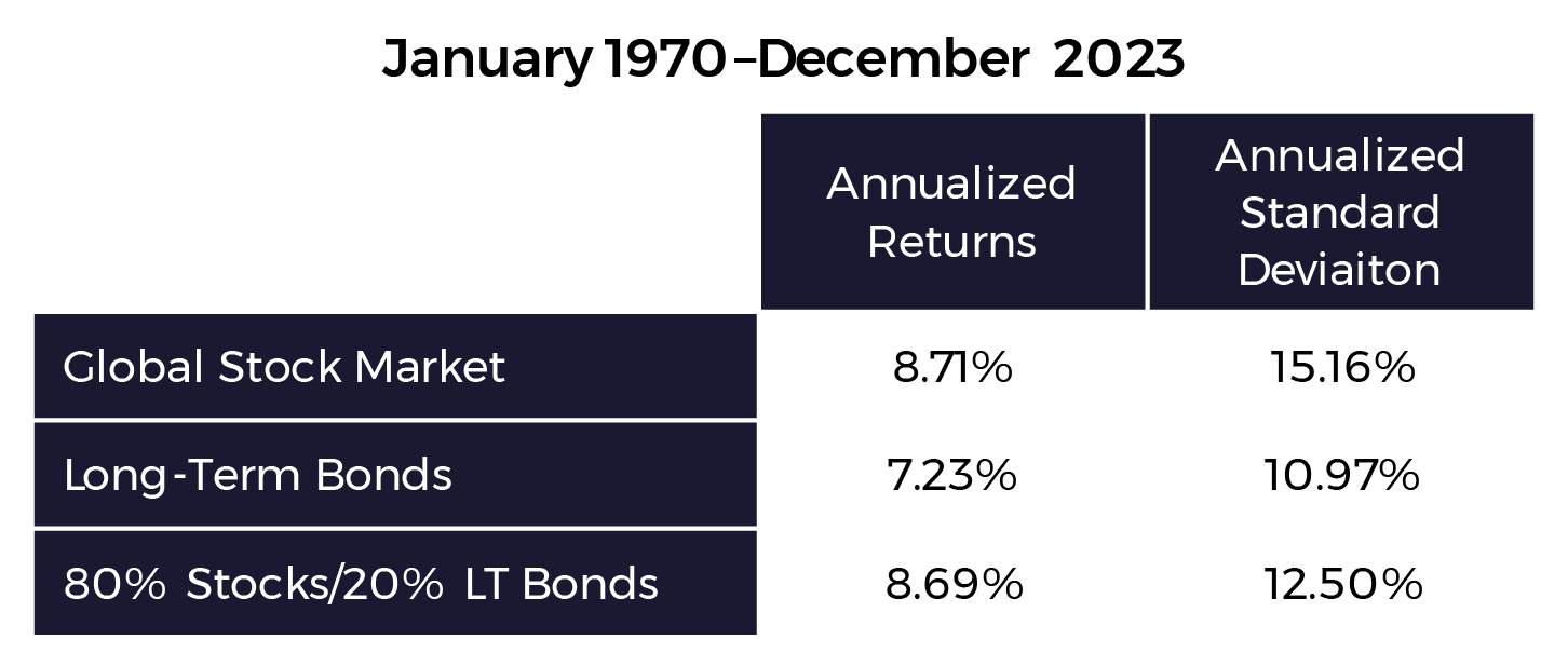
With the 80/20 portfolio, we were able to substantially reduce risk relative to 100% stocks. By including 20% long-term bonds in the stock portfolio, observed standard deviation during this sample dropped from 15.16% to 12.50% with very little impact on returns. This is possible because of the low correlations between stocks and bonds. From January 1970–December 2023, the correlation of monthly returns between the global stock market and long-term bonds was 0.083.
Why Long-Term Bonds?
I’ve focused on long-term bonds without offering a reason why those instead of shorter-term bonds or an aggregate bond index. The answer is because long-term bonds are likely a better option for diversifying high-stock portfolios. To illustrate, let’s compare historical performance of long-term bonds, shorter term bonds (represented by 5-year US Treasuries) and the Bloomberg US Aggregate Bond Index (“US Agg”) during months when the stock market was up versus months when the stock market was down.5,6
I had to use a later start date of January 1976, as that’s when data for the US Agg was first published, but including data back to 1970 does not change the conclusions for the other bond series.

Of the 576 months in this historical sample, the global stock market was up 361 of those months, and it was down 215 of those months. Looking at the average performance of each type of bond, long-term bonds had better average performance in up-market AND down-market months. In other words, as a complement to stocks, they’ve provided better downside protection and upside participation that’s at least as strong as the other bonds.
Further, below is the correlation matrix of the global stock market with the three bond indexes. Looking across the global stock market row, we see long-term bonds have the lowest correlation. It’s roughly equivalent to that of the 5-year Treasuries, but the US Agg has materially higher correlation with the stock market, making it a less attractive candidate for diversification, all else equal.

In short, the returns to long-term bonds have historically exhibited low correlations with the returns of the global stock market — lower than other broad bond categories — and they’ve provided just as much protection during down times while being less of a drag in the up times. This is what makes them great candidates for diversifiers in a high-stock portfolio. All that said, long-term bonds are A LOT more volatile than short-term bonds when considering each independently, and as such, long-term bonds can only reduce portfolio volatility to a point. For those needing or wanting an even lower-risk portfolio, one should likely incorporate shorter duration bonds, though that discussion is beyond the scope of this article.
Why 80/20?
I didn’t do any historical optimizations or data mining to decide this. I arbitrarily chose it to illustrate my points. I’m not arguing that 80/20 is the exact ideal proportion for investors with a high risk tolerance. There’s likely a range of allocations that make sense for those with a high risk tolerance.
What Happened in 2022?
Based on S&P 500 Index and long-term U.S. Treasury data going back to 1927, 2022 was the first calendar year the S&P 500 was down and long-term bonds were down more. In other words, in every other down-market calendar year going back to 1927, bonds softened the blow to your stock portfolio. I can’t pin down the exact reasons why this broke down in 2022, but my own personal framework (which could be wrong) for what happened is as follows: Bonds tend to do well during stock market downturns because investors flee the risk of stocks for the stability of bonds. That flight from risk to stability means the incremental investor is selling stocks and buying bonds, which drives bond prices up as stock prices fall. During 2022, interest rates increased from unprecedented historical lows, driving bond prices down, and bonds became volatile and much less predictable. They certainly did not exhibit their typical lifeboat behavior. With bonds not providing their normal stability, investors sold everything including bonds, and there was no place to hide. Everything went down. There’s no certainty about future returns or the future relationship between stocks and bonds, but I personally don’t think the long-term-risk tradeoff relationship of stocks and bonds is broken, which means I think bonds will generally protect wealth during stock market downturns and be a key ingredient in reducing stock portfolio volatility. I think 2022 was something of an anomaly, and like most things, I’m comfortable relying on overwhelming long-term averages to build long-term portfolios rather than fitting things to an exception. That decision is up to you, of course.
SOURCES
1 Global Stock Market defined as MSCI World Index (net div.) from January 1970–May 1994 and MSCI All Country World IMI Index (net div.) June 1994–December 2023. All sourced from Dimensional ReturnsWeb.
2 Long government bond data sourced from Morningstar and provided via Dimensional ReturnsWeb.
3 For each month from January 1970–December 2023, this portfolio is a weighted average of 80% global stock market (as defined previously) and 20% long-term US government bonds (as defined previously). This amounts to a monthly rebalanced portfolio.
4 Source unknown.
5 Dimensional ReturnsWeb.
6 Ibid.


